Hate to tell you this, but marketing isn’t the most important thing for your business. It’s not even the second most important thing.
There are two other things you’ve got to get right first. And without them, all the marketing in the world’s not going to save you.
You need a great product. And you need a great customer experience.
Here’s the stats. 63% of your customers will never return if they’ve had a bad customer experience. That’s the cost of getting it wrong. On the flipside, 86% are willing to pay more for a good customer experience. See how it works?
We’re going to take a look at three examples of great online customer experience.

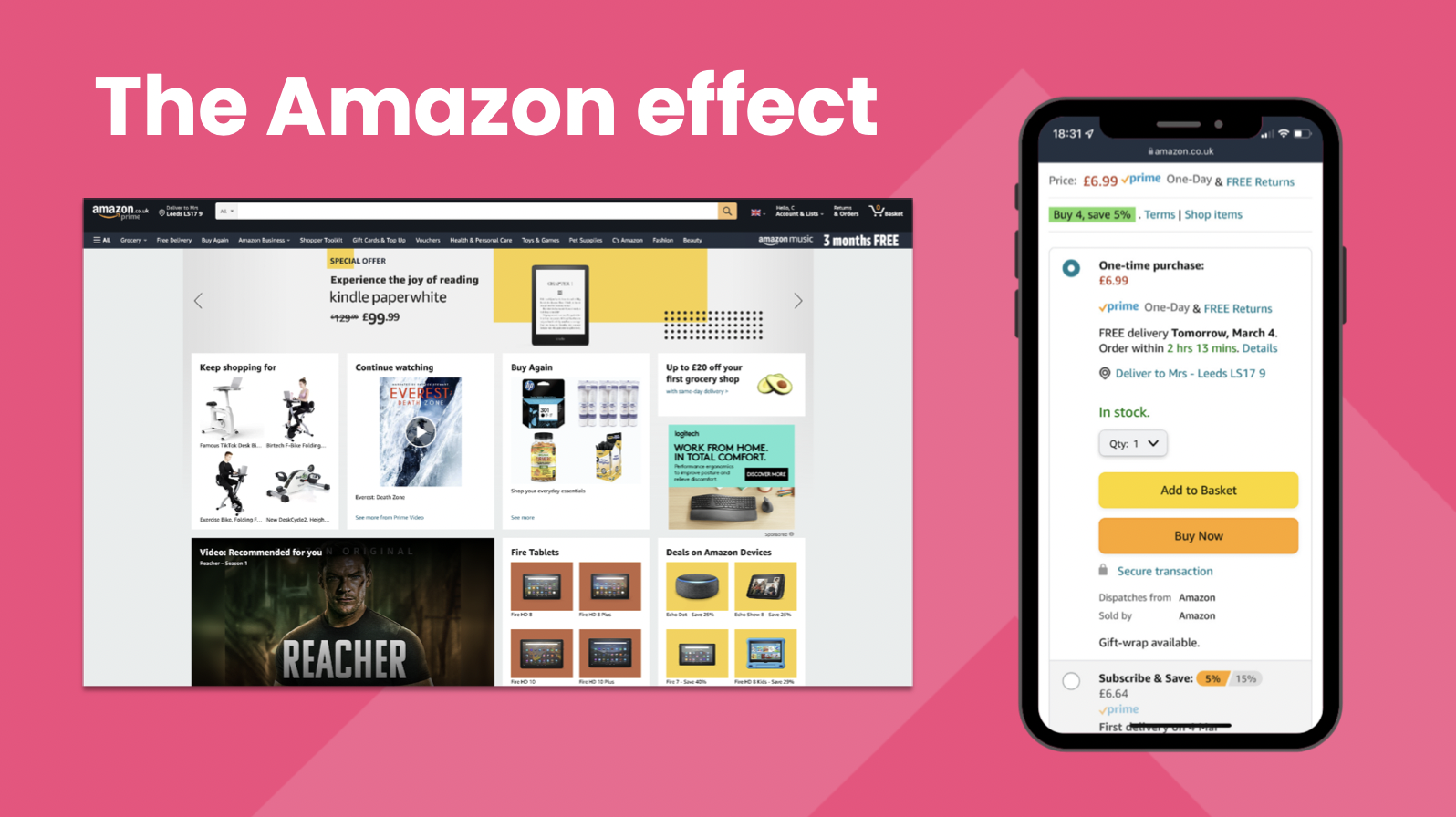
Amazon
At Trio we sometimes talk about ‘The Amazon Effect’. Amazon are the world’s largest retailer, with revenues in excess of $400bn.
Amazon’s complete global dominance is astonishing – to the point that we forget that smaller companies can still learn a lot from examining Amazon’s marketing techniques. We might not be able to replicate all their advantages, but there’s still things here we can use. The Amazon website is a masterpiece of online customer experience. Let’s take a closer look.
It’s personalised. Assuming you stay logged in on your device, Amazon are going to greet you by name. They’ll generate a home page that’s based on recommendations for things they think you’ll want, including items that you browsed previously. There’s millions of people on Amazon at the same time, and not one of them is seeing the same home page.
Does this matter? Yes it does. 80% of consumers are more likely to buy from businesses that offer more personalised experiences, and 49% of buyers have made an impulse purchase after a more personalised experience
There’s social proof. We talked in last week’s blog about the importance of social proof – how customers are influenced by the recommendations of other customers. Amazon have always understood this, and most products have more reviews than you’re ever going to need.
Effortless ordering. A round of applause, please, for whoever designed that checkout widget. It’s there on every product page. You can see the price, the delivery cost, and you can see when you’ll get it (along with a clever little countdown – creating a sense of urgency, as well as being super-useful for last-minute Christmas shopping).
And there’s the ‘1-click checkout’. The palace of Jeff Bezos must have reverberated for weeks with the sound of his creepy laugh when his minions presented him with this automatic money extractor. It knows who you are. It knows where you live. It knows how you’ll pay. After the apocalypse, you’ll still be using the 1-click checkout with your remaining thumb to order your cockroach burgers and radiation shields.
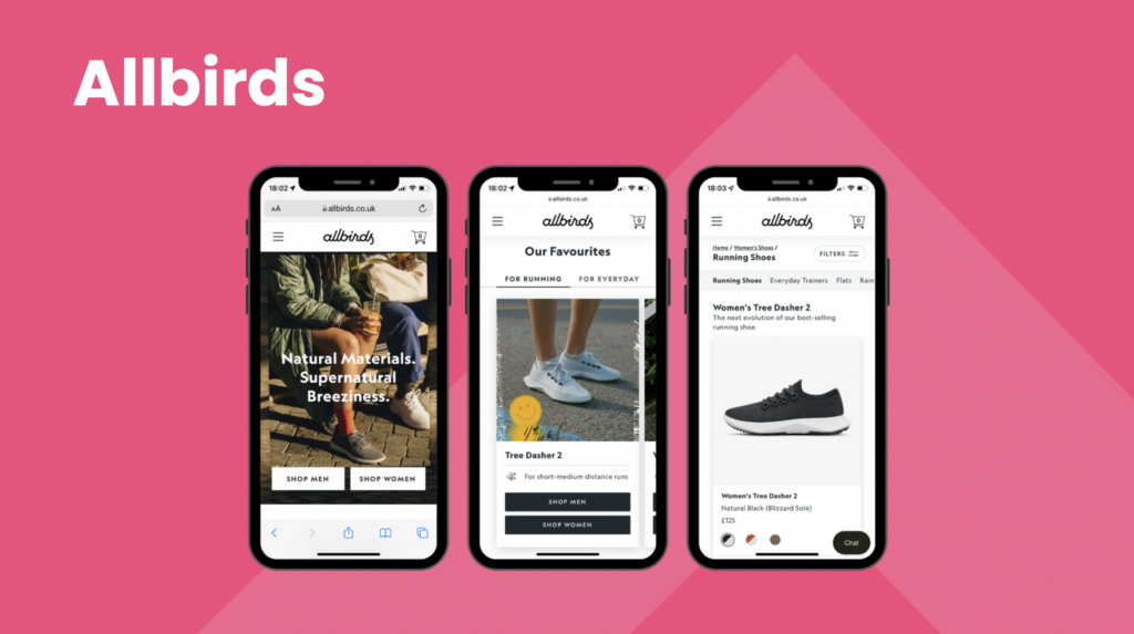
Allbirds
You don’t need a net worth greater than the GDP of most South American countries to create a great user experience. Allbirds achieve great results here, simply by anticipating how the customer is going to use the site.
Ease of navigation. The Allbirds site does a great job of getting you to the shoes you want in the smallest number of clicks possible. Do you want men or women’s shoes? (A bit binary, but it’s arguably a useful shorthand for getting to the size and design aesthetic you want.) Are you wanting trainers for running, or for looking good? You can backtrack on your choices at any point, as the UI handily keeps the categories listed at the top.
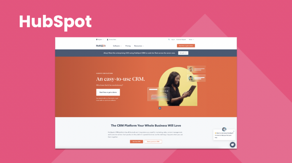
Hubspot
Big fans of HubSpot – one of the best content marketers out there, their blogs and learning resources are an essential tool for anyone interested in digital marketing. They practice what they preach too, as this homepage demonstrates.
A clear proposition. It’s good to be funny. It’s good to be clever. But if you’re not clear, then ‘funny’ and ‘clever’ aren’t funny and clever at all – just annoying.
The penalties for overcomplicating your copy can be severe. ‘What are you selling?’, your customers scream as they scroll through pages of jargon and case studies. Or they just click away, and find someone who can explain things clearly.
Hubspot went for super-simple here, in keeping with their selling point. CRMs are often unwieldy and offputtingly complicated. ‘An easy-to-use CRM’ tells you exactly what you need to know, in a manner so simple it creates an expectation that their software is probably just as straightforward.
Enjoyed this blog? Then you might want to check out Trio CEO Claire Daniels (along with some other clued-up digital folk) in this in-depth online webinar about customer experience and website reviews.