As a marketing agency, you often find that your own marketing and branding comes last in your list of priorities. Like the age old saying of a builder’s house is never finished, the same goes for any other industry. But, as goes another popular saying – no rest for the wicked – we decided to roll up our sleeves and crack on with a company re-brand.
Trio Media has been established for almost two years; during that time as a growing digital marketing agency, we’ve helped a number of clients to transform their image and grow their brand. An organisation’s brand identity should be constantly evolving and so we thought now was time to refresh our look and to create a brand design that was more in keeping with our current identity.
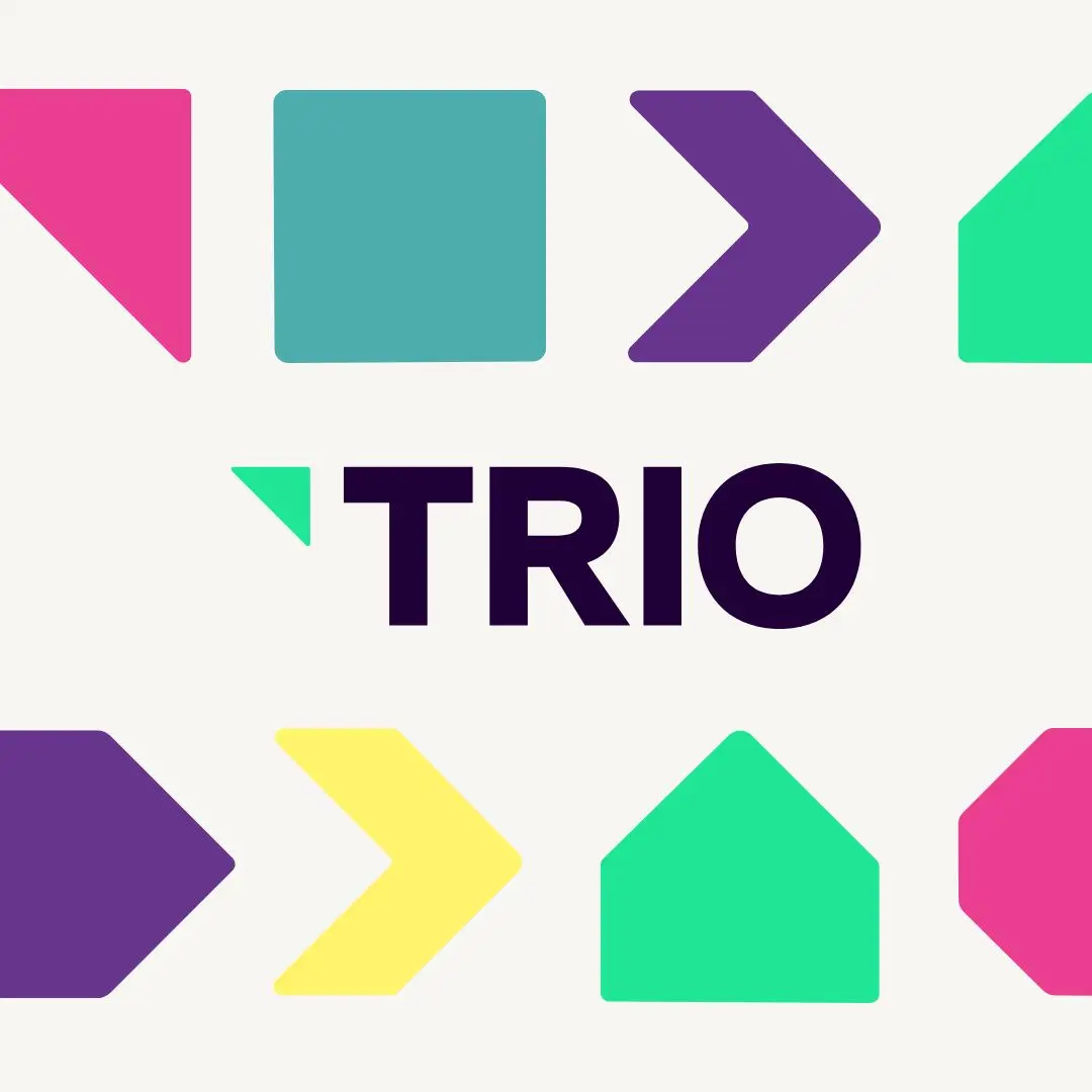
First of all, we started with our logo. We wanted to inject more colour – as a creative marketing agency we have to be expressive and so the use of bold colours helped us to revamp our logo. Secondly, we were keen on incorporating some new iconography that helped to demonstrate our core passion, which is performance. We designed the arrow in replace of the ‘I’ in Trio as a way of showing business performance improving and ‘going up’.
We kept our original orange as part of the Trio brand, but the inclusion of further bold colours will give us more freedom and flexibility in the creation of further marketing and graphic design. We then put together our branding guidelines, giving a clear overview of the colours, fonts and styles and when and how these should be used.
The next most important part of our brand design project was our website. As a digital marketing agency, we place a lot of importance on the online presence of a business. Having a brand identity that works for digital and can adapt across several platforms including social media and print is vitally important.
We really wanted to inject further colour into our website, and we loved the colour splash idea. We had several reasons that made the colour splash feel right for our home page. Firstly, the paint splash signifies a bang and a clash, colours or elements coming together to make something new and exciting. Secondly, the use of bold and vibrant colours shows creativity and daring, a sign that we’re not scared to take risks and try something different. Then finally, the use of rainbow colours signifies unity and inclusion, something which we’re really passionate about.
We think our re-brand has given a really welcome injection of colour and personality to our brand that was well in need of being updated. What do you think? Let us know your thoughts!
If you think your company is in need of a rebrand, but you don’t know where to start, then contact us today. We can help to form your identity from colours and styles, right through to names, straplines and tone of voice. Get in touch today for more information.