What makes a great website? While a website with all the bells and whistles seems appealing, success comes from simplicity. This applies to every aspect, from how users navigate your website to how they interact with your brand.
Back in January, we set some website design predictions for 2024, which many brands have adopted this year. The shift from aesthetic design towards effective, user-friendly websites is no surprise – in fact, it’s the basics of great website design.
There are plenty of web design principles, but some outweigh the rest. For our Head of Design, Gary Hanna, five golden rules always apply. Read on to discover what design elements make for a successful website.
5 golden rules of good website design
1. Alignment
Alignment is intentionally positioning images, text, buttons and other elements in relation to each other to achieve an aesthetically pleasing and organised interface.
You need to ensure there is enough space around each element and that content appears in places that are logical and expected by the user. Alignment is particularly important when you consider a website’s responsiveness. It helps organise and make sense of content across different screen sizes, which is crucial since 86% of people use mobile to go online.
Alignment draws attention to specific sections of your website, starting from your hero banner all the way down to the contact form. For e-commerce websites, the main purpose is to sell, so alignment can help guide shoppers to products and key features before buying.
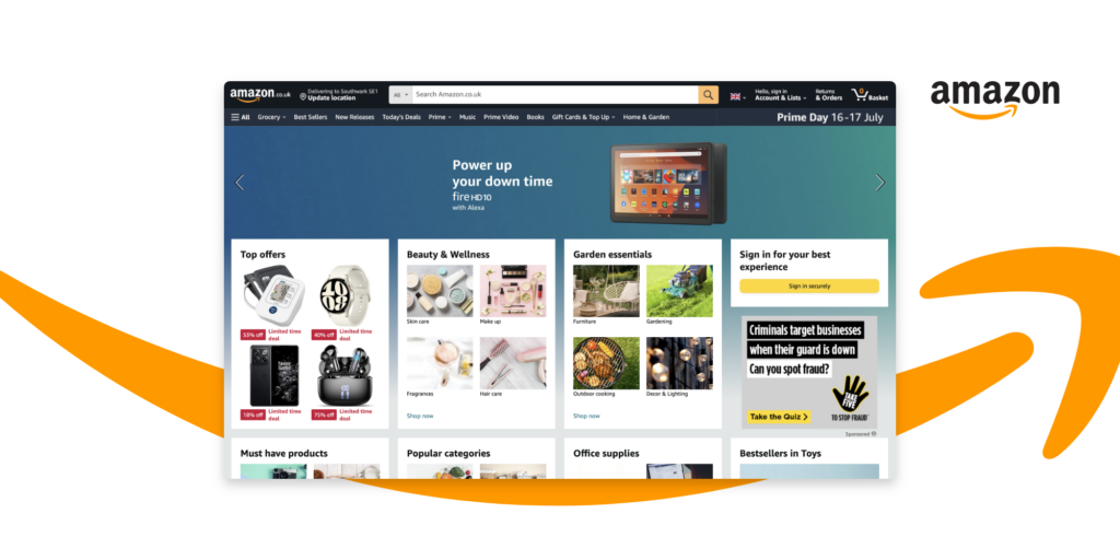
The global powerhouse, amazon, uses strong alignment across every page to simplify the shopping experience. Whether viewing on a desktop, mobile or in the app, product images are aligned to ensure shoppers can quickly skim through what’s on offer.
2. Repetition
Repetition can be simply reusing the same or similar visual elements throughout your design. When done right, repetition creates a sense of unity and cohesion that users come to expect from websites.
Humans prefer order over chaos, so we find patterns in everything. Repetition in website design offers the clues our minds are trying to find. So, repeat design elements, create memorable patterns and reinforce your key message in every bit of web copy. The results? Increased brand recognition and better navigation.
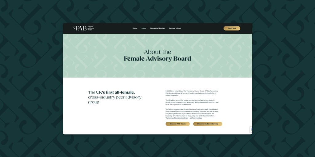
This year, we rebranded the Female Advisory Board (FAB), a cross-sector peer advisory group that helps female founders scale their businesses. Along with a new website, we created patterns in the headers and footers using the ‘F’ from their new logo. This reinforced FAB’s branding everywhere so it would stick in the user’s mind after leaving.
We also used high-contrast gold for all the CTA buttons to give the user a clear indication of important information.
3. Contrast
Contrast in web design refers to using visually different design elements together. The less alike the elements are, the greater the contrast between them. Creating contrasts helps content stand out on a website, such as a CTA button that is coloured differently to its background (See FAB example above).
You can play with colour, size, space, shape and how the foreground and background interact. These contrasting elements create a visual hierarchy of information your reader wants to hone in on.
The most important reason for adding contrast is that it makes your design more accessible and readable. This is the best practice for website design that complies with the international Web Content Accessibility Guidelines (WCAG).

Our recent website project for Grayce, a hire, train, deploy consultancy in change management, is a prime example of using contrast well. We employed high contrast to ensure accessibility standards (e.g., WCAG) were met whilst creating a dynamic and exciting design to appeal to their core demographic.
4. Hierarchy
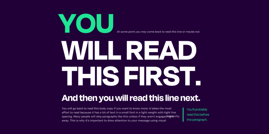
Hierarchy is how you organise visual elements and messages in order of importance to guide users through the page. Visual hierarchy predicts where users will navigate, placing CTAs and information in areas they’re most likely to view. You can tailor this to your goal, such as driving leads or conversions. Here is what a visual hierarchy looks like in action:
A visual hierarchy enhances user engagement, guides users and creates a scannable website. As we know, most people don’t read websites; they just skim. That’s why many brands shape their websites around reading patterns.
Common layouts include F-shape and Z-shape, which are based on the pattern of how individuals pick up information when reading.
When it comes to the messaging, you need to ask yourself:
- What is my user thinking about or want to see when landing on our website?
- What do we need to show (visually) and tell to change the user’s mind? What are their pain points?
- What do we want our users to do before leaving? Is it to buy a product or fill out a contact form?
These questions are a good starting point for refining your copy around your user’s wants and needs.
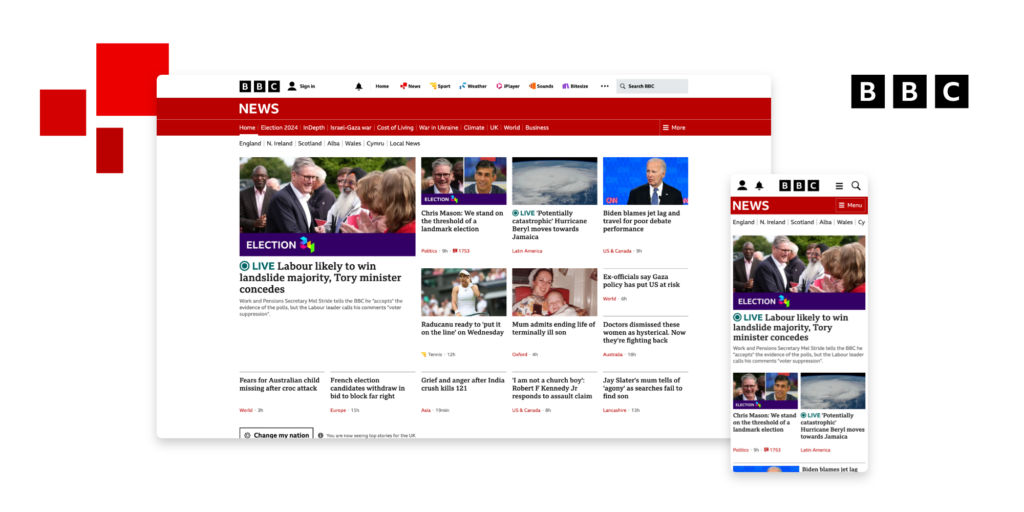
Like the BBC, a news site uses clear headlines and a logical structure that prioritises the most pressing news at the top and other coverage further down. This helps create a clear information hierarchy so users can quickly scan for important or interesting information.
5. Balance
Everybody wants balance, so why shouldn’t your website do the same? In web design, balance can be achieved through symmetry or asymmetrically through tension.
- Symmetrical balance: The visual weight of elements is evenly distributed across a page. Each side will appear stable and orderly, creating a perfectly balanced design.
- Asymmetric balance: Different visual weights will appear on each side of a page, but will appear balanced by how the heavier and lighter elements are positioned. Asymmetrical balance creates tension, encouraging users to stop and take a better look at the conflict caused.
White space is often an overlooked design element that can create balance and make large sections of web content appear less overwhelming. Just look at how Apple does it:
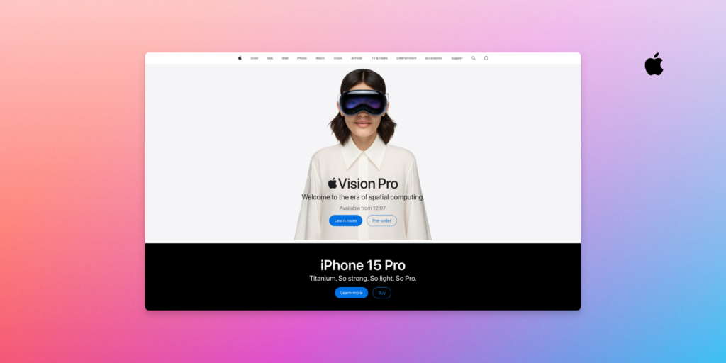
Apple relies heavily on white space on product pages to ensure its solutions take centre stage. For Vision Pro, balance creates a real sense of anticipation and quality.
Website design done right. Trio is here to help.
At Trio, we design and build bespoke WordPress, Shopify and HTML5 websites for brands across sectors. We understand the importance of quality coding, great design and SEO best practices.
Interested? Share your website brief with our team.