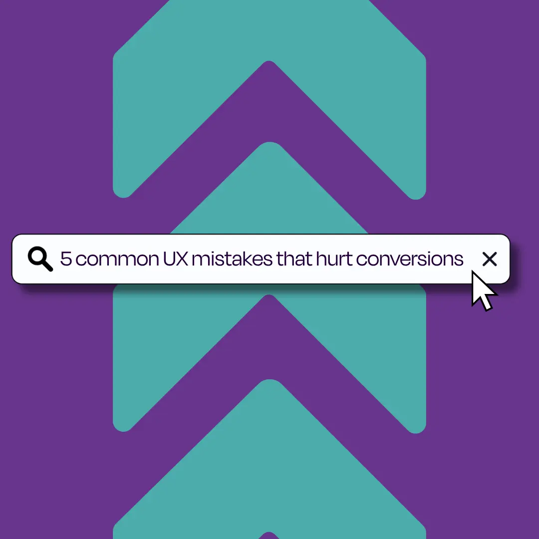
The most common UX mistakes that hurt conversions include:
- Confusing navigation
- Slow page load speeds
- Unclear call to actions (CTAs)
- Poor mobile experience
- Web copy that fails to speak to user’s needs
Each of these issues creates friction in the user journey, making it harder for visitors to take the action you want them to take.
As a web design and development team, we see these mistakes regularly. Here are the top 5 most damaging UX errors we encounter, along with how to fix them.
TL;DR – UX mistakes that lose you conversions
- Poor navigation stops users from finding what they need and increases bounce rates.
- Slow page load speeds frustrate users before they even see your content.
- Weak or missing CTAs leave users with no clear next step.
- A broken mobile experience alienates the majority of your web traffic.
- Copy that talks about features rather than benefits fails to connect with your audience.
Mistake 1: Confusing navigation that loses users
Confusing navigation is one of the fastest ways to drive users off your website. When visitors cannot quickly find what they are looking for, they leave. Good navigation reduces friction, guides users and helps drive conversions.
We recommend keeping your main menu to a maximum of seven items. Anything more and the menu becomes cluttered, making it harder for users to make a decision. Every item in your navigation should reflect a clear user need, not just an internal business category.
How to fix navigation issues on your website
- Use a sticky navigation bar so your menu is visible at all times. A nav bar that follows users as they scroll means key pages are never more than one click away.
- Apply a clear visual hierarchy throughout the website so users know which content to read first and where to go next.
- Use a full burger menu on mobile that opens to cover most, or all of, the screen. A basic dropdown menu only works for single-tier navigation.
- Include breadcrumb navigation to give users a clear sense of where they are on your site and help them to backtrack without hitting the browser’s back button.
- Add a search bar for users with a specific goal in mind. This provides a fast route to what they need and removes the need for them to second-guess the navigation.
Mistake 2: Slow page load speeds that lose customers
Speed is not a nice-to-have, it’s a conversion essential. Page speed plays a major role in whether users stay, browse and convert.
Even a delay of a few seconds can send a potential customer to your competitor. The most common culprit? Unoptimised images. Large file sizes significantly slow down load times, and on mobile this is even more damaging. Google also considers page load speed as a ranking signal through Core Web Vitals, so slow load times hurt your visibility in search as well as your conversions.
How to improve page speed for better conversions
- Convert images to WebP or AVIF format. These maintain quality with significantly smaller file sizes than JPEG or PNG.
- Compress images before uploading to reduce further without sacrificing the quality.
- Enable browser caching (we recommend Cloudflare) so returning users load your site faster.
- Use Google PageSpeed Insights to identify what is slowing your website down and prioritise fixes accordingly.
Mistake 3: Weak or missing calls to action
A call to action (CTA) is the prompt that tells the user what to do next. Without a clear CTA, users are left to figure it out on their own, and most won’t bother! Whether your goal is to generate enquiries, drive downloads or encourage purchases, every page needs a purposeful CTA that guides the user towards that outcome.
The mistake we see most often is CTAs that are either buried at the bottom of a page, not enough colour contrast to make them stand out, are too vague to motivate action (think ‘click here’) or simply missing from key landing pages altogether. Your CTA needs to reflect what the user wants as much as what your business needs.
Best practices for CTAs that convert
- Place CTAs strategically throughout the page, especially high up, not just at the bottom. Users will engage at different points of the content. However, you must be careful not to add too many CTAs on one page as this can be overwhelming for a user and have the opposite effect, be sure to use purposeful placement.
- Use action-led, specific language: ‘Get a free quote’, ‘Book a demo’ or ‘Download the guide’ perform better than generic prompts like ‘find out more’.
- Make CTAs visually distinct. They should stand out from the rest of the page through contrast, size or button design.
- Align your CTA with users’ intent at the point in the journey. A first-time visitor on the homepage needs a different prompt than someone already browsing your service pages.
Mistake 4: Ignoring mobile experience
Mobile now accounts for the majority of global web traffic. Google operates on a mobile-first indexing basis, which means it primarily uses the mobile version of your website for ranking and indexing. If your mobile experience is broken, you are losing both rankings and conversions at the same time.
At Trio, we approach every website build with a mobile-first design philosophy. This means the mobile experience is not an afterthought; instead, it forms the entire design process from the first wireframe. Layouts adapt to different screen sizes, buttons remain tappable, text stays legible and forms are simplified so they are easy to complete on your phone.
How to deliver a strong mobile UX
- Design layouts that automatically adapt to different screen sizes, from desktop to tablet to mobile.
- Keep forms short. Minimise required fields and use autofill where possible to reduce friction on mobile.
- Test your website across browsers, devices and screen sizes to catch inconsistencies before they affect real users.
- Use Google Analytics (GA4) device data to understand how your audience accesses your site and prioritise accordingly.
Mistake 5: Copy that talks features, not benefits
Great UX is not just about design and development, the words on your website are just as important. Website copy that leads with features rather than benefits fails to connect with users. When a visitor lands on your page, their first question is: ‘What’s in it for me?’ If your copy does not answer that quickly, they will leave. Think about your customers’ pain points and answer why your product or service can help fix them.
We also see businesses using inconsistent tone across pages, as well as copy that ignores SEO best practices. In 2026, it’s safe to say that many are relying too heavily on AI-generated content that lacks genuine brand voice and a human approach. This diminishes trust and reduces the likelihood of your site ranking and converting.
Writing copy that supports conversions
- Always write from the user’s perspective. Focus on the benefit they receive, not just the features you offer.
- Keep a consistent tone across every page, including landing pages, the 404 page and thank you pages.
- Optimise copy for SEO. Include structured headings, internal links and keywords that align with your audience’s search intent.
- Use a clear typography hierarchy so users can scan your content easily and find the information they need quickly.
Is your website losing conversions to poor UX?
At Trio, we specialise in websites that look great and perform even better. Our web design and development team combine purposeful UX, responsive design, optimised copy and a Conversion Rate Optimisation (CRO) approach.
If you’re unsure where your website is falling short, we can help you find out. Get in touch with the Trio team today.
FAQs
Poor UX creates friction at every stage of the user journey. Confusing navigation, slow load times and unclear CTAs all reduce the likelihood that a user will take action. Even small improvements to UX, such as simplifying your navigation or speeding up load times, can impact conversion rates.
Yes. Google uses Core Web Vitals, which measure page speed, visual stability and interactivity as ranking signals. A well-designed, fast and accessible website performs better in search results. Accessibility features, semantic HTML and mobile responsiveness all contribute to stronger SEO performance as well as a better user experience.
Common signs include high bounce rates, low average session duration, poor conversion rates and user drop-offs at specific pages in your funnel. Google Analytics (GA4) and heatmapping tools can help identify where users are struggling. A UX audit by a web design specialist will give you a clear picture and a list of improvements.