Think about the last website you visited. Did you end up buying something straight away? Or did you feel like you were in a labyrinth navigating its menu?
Whatever the website, you want to experience it with ease. The website (or app) has to work for you, not against you. If it feels cumbersome to use, you’re in the wrong place. User experience (UX) design is about making a website easy to use, accessible and convenient.
It goes beyond the aesthetics of design and into how you can make users’ lives easier. In this guide, we speak to our experts in web design, development and SEO to find ways to improve your website’s UX in the new year and beyond.
Want the answers now? Jump ahead to each section below:
- Determine your website goals
- Keep your branding consistent
- Optimise imagery
- Follow an effective typography hierarchy
- Make navigation simple
- Design with all screen sizes in mind
- Write copy that speaks to your audience
TL;DR – What you need to know
Improving your website’s UX means focusing on usability, accessibility and relevance. Start by defining your website’s goals, then optimise elements like navigation, typography and imagery for easy functionality.
Prioritise responsive design for all devices and write audience-focused copy that speaks directly to their needs. Consistent branding, fast load times and intuitive layouts all work together to create a user-friendly experience that keeps visitors engaged and coming back.
What is user experience (UX) design?
User experience design is the process of building a product or service that’s intuitive, easy to use and relevant to users. When designing a website, we’ll consider the who, why, what and how of a user experience. First, who are we targeting? Why are they visiting the website? Is it to complete a task, make a purchase, learn more, or something else?
The ‘what’ refers to functionality, aka what users can do when they visit. The ‘how’ is about combining functionality and aesthetics in an accessible way. Out of all these, the’ why’ matters the most. Like any effective marketing strategy, understanding your customers’ motivations and pain points is key. When you factor this in, the’ what’ and’ how’ become clearer.
The navigation, buttons, call to action, and every other design element must guide users to their desired outcome. Good UX design also relies on engaging content – your copy needs to provide answers and relate to your users’ challenges.
How to improve user experience
1. Determine your website goals
A website has many different purposes. It could be a high-converting e-commerce store or a simple brochure website that informs users about a brand’s products or services. What you want to achieve from your website will depend on your goals and ultimately impact how the website looks, feels and functions.
Take, for example, a B2B software brand. Their goal is to improve conversions, whether that’s by encouraging users to book a demo or get in touch. To get users to this point, the website will need clear call-to-actions in strategic locations, content that answers their questions and simple navigation that helps them find what they’re looking for.
Once you know your goals, everything else you need to improve for UX becomes clearer. That’s why, at Trio, we take a strategic approach – ensuring your website aligns with your marketing efforts.
2. Keep your branding consistent
Your brand represents who you are, what you stand for and what you value. Keeping it consistent means your look and feel are the same across every platform your customers see you on.
Strong brand consistency drives brand recognition and signals to Google your content is to be trusted. Customers who recognise you are more likely to trust and buy from you. So, if your website is starkly different from other touchpoints, don’t expect users to stick around. Here’s what you can do:
- Conduct a brand audit – You must assess the number of touchpoints and evaluate your customer experience. How do customers interact with your brand? What do they value from you?
- Create a brand style guide – Everything, including your colour palette, logo, fonts, and images, must align with your brand image. Keeping them uniform will help customers recognise your brand more easily.
- Establish a tone of voice – You must determine your voice (personality) and tone (how you speak). This includes how you word things and anything you want to avoid.
- Keep your brand consistent on every page – And we mean every page: your landing pages, ‘thank you’ pages and even policies hidden in your footer. Your brand shouldn’t differ between pages; the design and tone must be the same.
Remember, UX design is about making your website easy to use. A consistent brand image and message will help you gain more customers’ trust and make the brand experience more relevant to them.
3. Optimise imagery
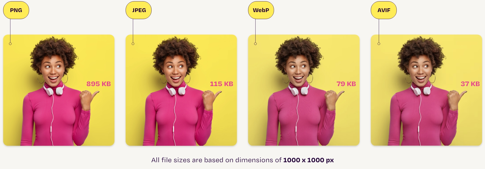
Around 70% of people decide whether to buy online depending on how fast a web page loads. People are impatient, and if your page loads even a few seconds slower than expected, they’ll go for the next best thing.
Image optimisation can prevent this and greatly improve page speed and SEO. Faster load speeds reduce customer frustration and allow you to provide the content you want quickly.
How to optimise images for the web:
- Choose the correct file format – The best formats to choose are WebP or AVIF, which are great for maintaining image quality but have much smaller file sizes than JPEGs.
- Add alt text – Alternative (alt) text describes the function or appearance of an image on your website. Doing this has two major benefits. One, you can optimise images with keywords, helping search engines understand your content better. Two, alt text helps visually impaired people understand pictures and graphics being described on a screen reader. Accessibility is core to a good user experience.
- Compress images – Image compression means reducing an image’s size in bytes while retaining its original quality. Reducing file size will free up space on your website and improve load speed.
Your choice of images also depends on how you want to represent your brand. For example, if you’re a fashion brand, your clothing shots should include people who reflect your target audience. Getting your images right will say a lot about your brand.
4. Follow an effective typography hierarchy
Typographic hierarchy refers to how you organise text on a page. It tells users where to look and which information is most important.
A website has three main levels of hierarchy – the heading, subheading and body text. Your headings contain the most relevant information, which the user will most likely scan. Subheadings add further detail, and your body covers everything else. You can style the hierarchy with different fonts, case, weight, colour and alignment. You can see this in the examples below.
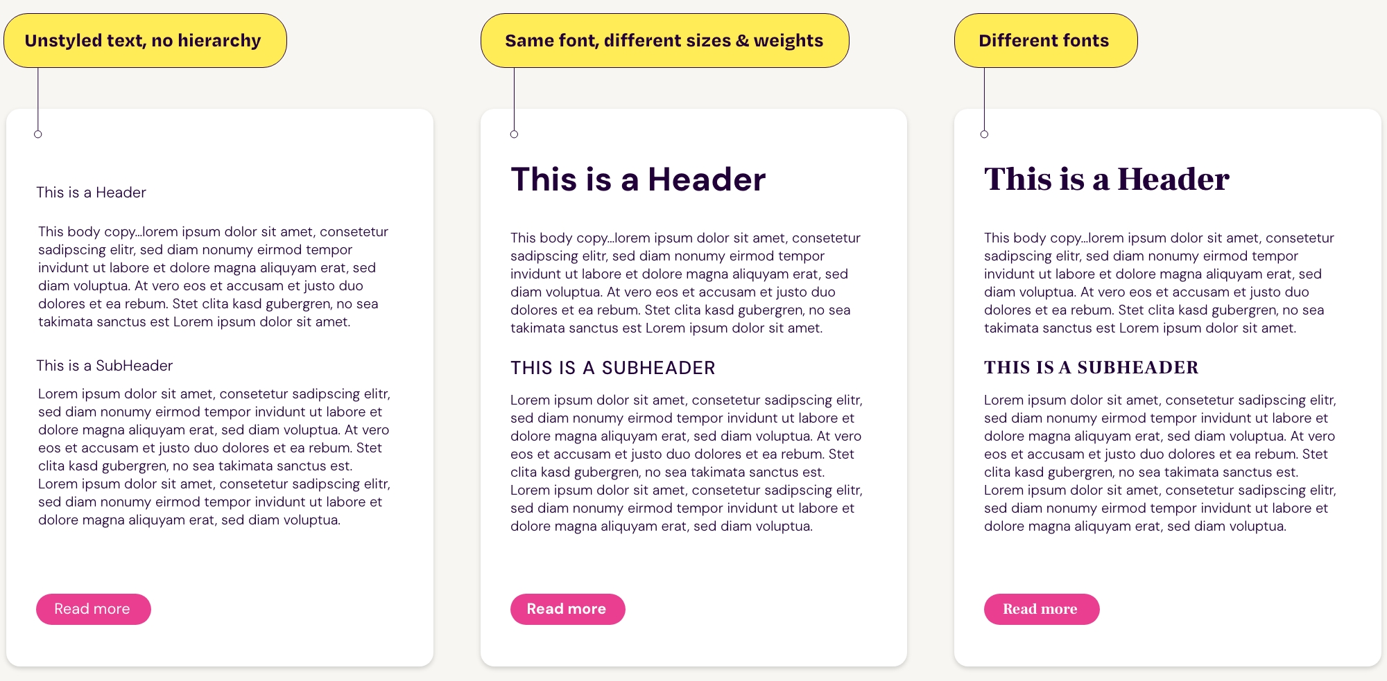
Typography hierarchy is a stylistic and structural element. Your headers or subheaders should include header tags (H1, H2, H3, H4) that signal to search engines and users which content is most relevant. This hierarchy also enhances accessibility by making content easier to navigate for screen readers and users with visual impairments.
This is especially important for blogs, which need several header tags to break up text and improve readability. (You’re seeing it in real-time here!)
5. Make navigation simple
Good website navigation is key to a great user experience. Your menu, buttons, copy and link text all help users find what they’re looking for.
Your website menu should categorise content to meet users’ needs and expectations. For example, one section may be ‘services,’ which leads to a list of all your services. This sub-navigation makes it easy for users to find what they want. Your menu should have a maximum of seven items. Any more, and it can appear cluttered.
Your menu must also be responsive on different devices. A hamburger menu, rather than a dropdown menu, is much more intuitive on mobile and helps users navigate your website easier. Getting this right relies on your website agency, which will prioritise responsive design from the get-go.
Other ways to improve navigation:
- Hierarchy – How you organise visual elements and web copy will direct users to what to read and where to go. Many websites use reading pattern layouts (such as F-shape or Z-shape), which follow how people pick up information.
- Call-to-actions (CTAs) – If your goal is to convert, you need CTAs to tell users what to do next. Is it to get in touch? Book a demo? Download an eBook? These CTAs must be strategically placed across your website to encourage action.
- Internal links – Including links to other pages will take users on a journey and help them find what they need more easily. (This is also key to your on-page SEO strategy.)
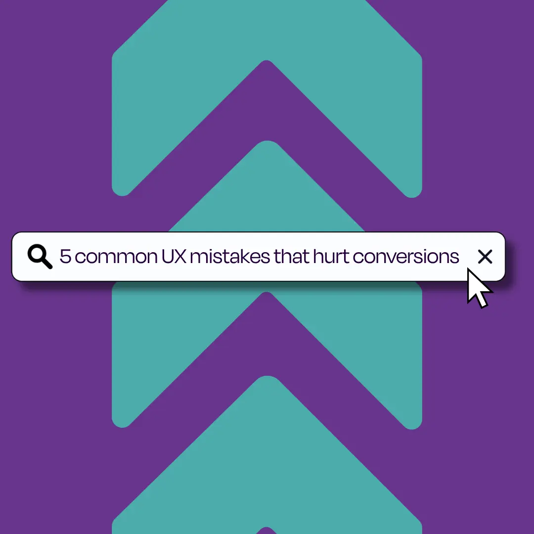
- Search bar – Users with clear intent will use search bars to find precisely what they want. This eliminates endless scrolling and improves navigation.
6. Design with all screen sizes in mind
Responsive web design considers how your website will appear on various devices and screen sizes. Whether on desktop or mobile, your website should automatically adapt to the screen so it’s easy for users to navigate and read your content.
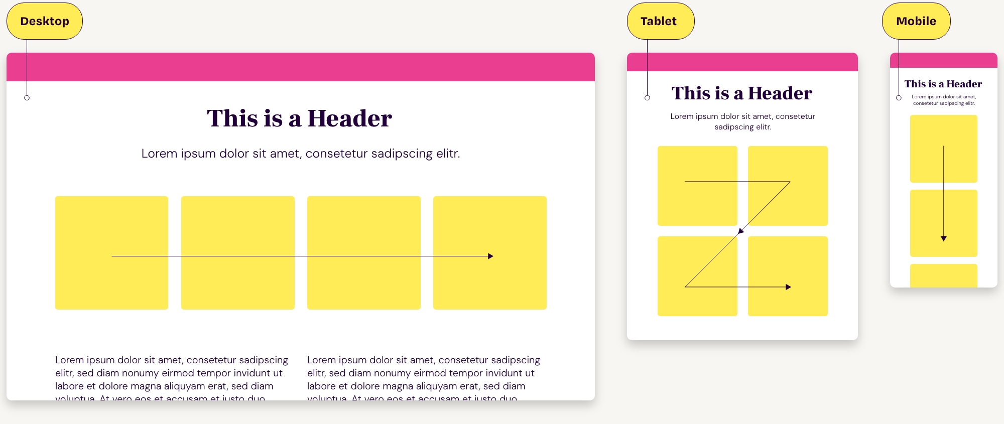
When we approach web design, we prioritise mobile-first design, which accounts for most website traffic. Google also primarily considers the mobile version of your website, making it a key ranking feature on SERPs. However, this doesn’t mean you should neglect desktop users. Audience research will uncover whether your users use a mix or rely on one screen more than the other.
Typical elements of a responsive website include how the layouts adapt to different screens, how intuitive the navigation and functionality are and how the images load across different devices. On smaller screens, you may need to hide or prioritise certain content so it can appear seamlessly.
7. Write copy that speaks to your audience
Writing great copy starts with who you are targeting, why they need it and what they’ll do next. By now, you should know your audience. (You don’t? Get a marketing strategy).
Your words, tone of voice and topics you write about all revolve around your customers. What do they want to see? Who do they need help with? Once you know that, write your web content in a relevant, trustworthy and people-first way. This type of content is valued by Google, which decides whether your website appears in SERPs.
Our recent collection on E-E-A-T, Google’s search quality rater guidelines, provides insight into how to action people-first content on your website. Read parts one, two and three now.
Other ways to improve your web copy for UX include:
- Write about the benefit, not the feature – What benefits does a customer get from your service or product? Always relate to their wants and needs.
- Keep it simple but familiar – How you speak to your audience depends on who they are. A technical brand will use jargon because it’s familiar to its audience. A B2B brand, like Monzo, wouldn’t, as they know their audience wants banking information to be simple.
- Say just enough – It’s easy to go off on a tangent. The truth is, you don’t need to say much to grab a user’s attention. Focus only on what your audience needs to know and leave the details for in-depth articles.
- Optimise for SEO – Your copy needs to work for your audience. Include header tags, internal links and keywords related to their search intent.
Want a website that works well?
At Trio, we specialise in websites that look and function great. We’re a strategic digital marketing agency skilled in all the services needed to improve user experience and make your website perform better than the rest.
Have a website brief? Or a few ideas you want to share? Let’s talk. We’d love to hear from you. Get in touch today.