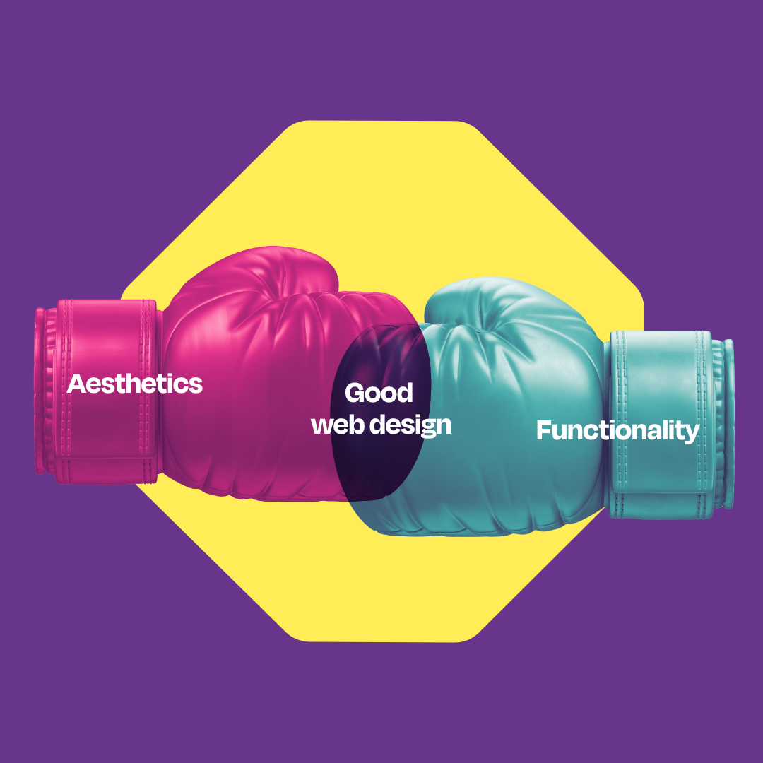
There is a careful balancing act between aesthetics and functionality when it comes to good user experience (UX). Get it right; you’ll generate more conversions and stand out. Get it wrong, and you lose users’ interest.
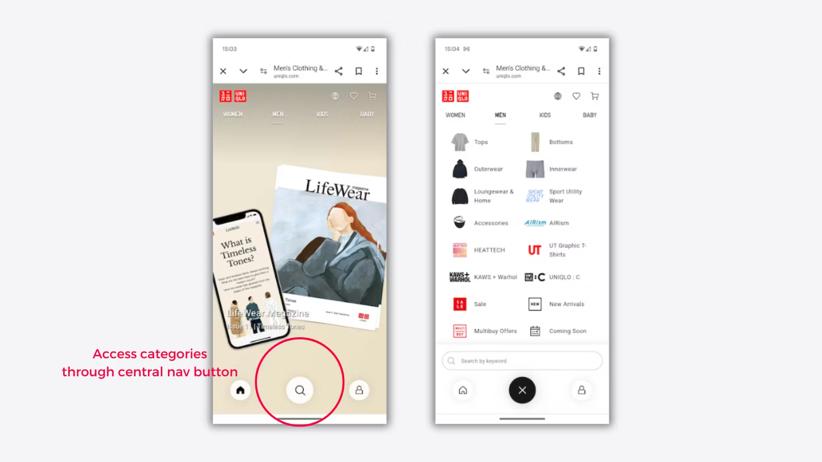
Even today, we see brands prioritise one over the other. Take the Uniqlo website, for example. Uniqlo redesigned its homepage and navigation bar to no longer have a clear menu button.
Instead, a magnifying glass icon, which most associate with a search bar, now functions as the menu for browsing Uniqlo’s catalogue. With poor UX, key category pages dropped on search and users actively voiced their frustration over the functionality online.

Credit: Econsultancy
So, what is the perfect balance? This is the age-old question designers have battled with since UX became a concept (that is, centuries ago). In this blog, we’ll uncover the importance of aesthetics and functionality and how you can find balance in web design.
What is aesthetics in web design?
An aesthetic approach focuses on a website’s visual appeal to create an enjoyable and engaging UX. When creating a website or application, designers consider graphic design principles like typography, colour, imagery, whitespace and visual hierarchy. However, visual appeal should never overcomplicate the user experience or, even worse, compromise functionality.
In our experience as a web agency, we’ve always encouraged our clients to view things from a functional perspective first. But that doesn’t mean aesthetics aren’t considered. A well-designed website can create a positive first impression and build trust with your target audience.
When we did our rebrand, we used aesthetics to shape and reinforce our brand image across the website, making it more memorable than before. Gary, our Head of Design, adds:
Your website is an extension of your brand, so to build credibility, you need an aesthetic that aligns with your audience.
What is functionality in web design?
Functionality is how well your website works and how easily users can complete their intended goals. This approach considers usability and accessibility, both essential for improving your search performance.
A functional website has an easy interface and navigation accessible to all users on any platform. At the end of the day, your website needs to convert (and work). And if your flashy design overcomplicates the user journey, you have bigger concerns than poor UX.
Functionality is key to boosting your conversion rate, something Claire, our CEO, passionately spoke about at marketingSHOWCASE. In Claire’s talk, she emphasised how simple site structures, clear messaging and noticeable CTAs will improve the overall performance of your PPC and SEO campaigns. (Contact us if you’d like a copy of our slide deck!)
Getting traffic to your site is simple enough, but getting them to convert is another thing. Functional design ensures the journey to the point of conversion is seamless, so your website does the work for you.
Achieving the perfect balance
Your website should never be a vanity project – it can still be aesthetically pleasing and easy to use. Your users need to enjoy browsing your website and find the answer to their problems without challenge.
So, how do you achieve both? Through user-centred design (UCD). User-centred design involves putting users at the centre of the design process. This is where some hard truths come into play: what you think is good is just your opinion – you need to think strategically. How can your website resonate with your audience?
You must prioritise the needs and preferences of your target audience. As you’ll see in our marketing strategy guide, research is where you’ll find most of your answers. Every design element should encourage interaction, whether filling out a contact form or browsing a product.
Consider these tips:
- Optimise for speed: Load time can easily turn users away, so optimise images and limit the number of animations so page speed remains quick and visual appeal stays on track.
- Responsive design: Your website must respond to different screen sizes, such as mobiles and tablets, without sacrificing functionality.
- Clear visual hierarchy: Place CTAs, information and imagery in places your users will navigate to. What goes first will depend on what you want your users to do before leaving.
- Concise messaging: Use clear, simple messaging explaining what you do and how you can make users’ lives easier. Cut the jargon and focus on your customer.
- Focus on accessibility: Include alt text, readable fonts and contrasting colours to ensure every user, including those with disabilities, can access your website.
- Consistent branding: Aligning your colours, fonts and imagery will create a cohesive look that increases brand recognition and improves navigation across your site.
- Use white space: Removing clutter and adding white space can create balance, making your website easier for users to scan and find the information they need.
- Test and test again: Regularly test the site’s functionality and aesthetics, making adjustments based on user feedback and performance analytics.
Looking for a web design agency? Let's talk.
Trio Media is a web design and development agency specialising in WordPress, Shopify and HTML5 websites. We follow a trusted process to create websites that are user-friendly, accessible and ready to rank on search engines.
Want a website that outperforms the rest? Contact our team, and we’ll make it happen.


